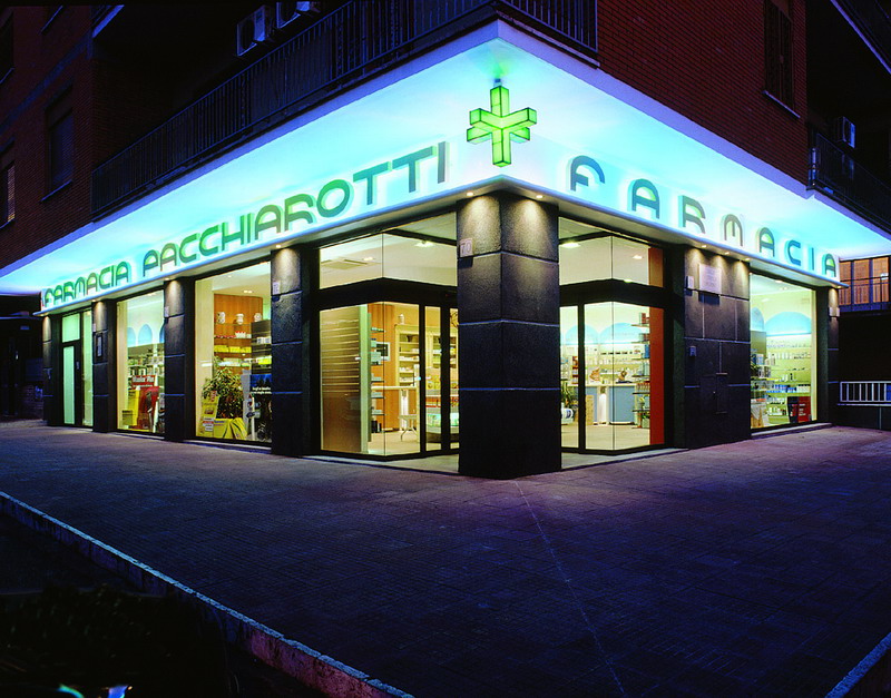
As often happens, the renovation of a pharmacy leads to the regeneration of the surrounding area. The new Pacchiarotti Pharmacy has become the focal point of the entire neighbourhood, visible from outside thanks to the wide shop windows that capture passer-by’s attention and the new two-colour sign in the shape of a star that is akin to a small lighthouse illuminating the square. A Sartoretto Verna pharmacy is unique and personalised, the result of a creative mix of advanced technology and traditional themes that we have fused together to create a true one-off. Innovation, tradition and the identity and preferences of the pharmacist are all combined into one.
Dr Giuseppe Pacchiarotti together with wife and children fervently believe in their pharmacy’s potential and had the brilliant idea of wanting to renovate and modernise both the building’s facade and interior. They must also be praised for using the renovation as an opportunity to radically transform the pharmacy, a rebirth which started off the regeneration of the surrounding area.

First of all, the project separated the public from the private areas. The dispensary and lab, office, stock room and a mini apartment for staff on night duty were moved to the upper floor and a lift was installed to connect the two. Any difference in floor level was eliminated by moving the prescription area and counter back a little and using mobile tills and display units. To create the space needed, all unused spaces like stairwells were recuperated.
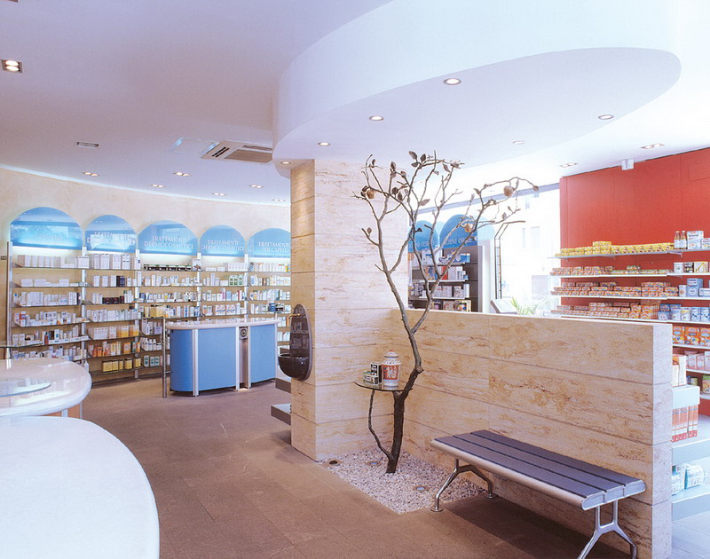
The project also led to the creation of a display area at the back of the pharmacy around the main counter. The highlight of this refurbishment is the use of front and back display units that can display as many products as wall-mounted display units yet do no block out light nor close off space. This enabled us to double the size of the retail floor.
It was also very important to study the how it was best to direct the circulation of customers around the pharmacy. The interior was designed in such a way as to oblige customers to pass by all product sectors, including medicines, complementary therapies, beauty and hygiene products. The customer takes a circular route around an tree in bronze displaying a wide range of promotional leaflets and brochures, a small stone fountain, seating and a long gondola-shaped display case for seasonal products and special offers. This central isle in Peruvian stone is further emphasised by an elliptical section of the ceiling that has been lowed to hang above the pillar like a cloud.
All of these elements combine together to create a reassuring and pleasant atmosphere where customers feel at ease and want to return.
When you enter the Pacchiarotti Pharmacy, the first thing that you are struck by is its luminosity, then the blue hues of the enamelled surface, the light blue of the display units signage that contrasts with the natural warmth of the pear-tree wood, and the ivory-coloured wood of the Classic line’s furniture. The lighting of both the interior and exterior was also carefully planned. A careful study was carried out focusing on the design of the facade, the signage and the windows which together define the pharmacy’s new style.

Once again, project design, the optimisation of space and an increased functionality come out on top, all of which have been decorated with an aesthetically pleasing and atmospheric wrapper.
When it comes to renovating or refurbishing a pharmacy, either in part or in full, the overall design is of primary importance before that of the furnishing. From your very first meeting, Sartoretto Verna will come up with a concrete idea rather than a rough sketch.


